

- SQDC for Enterprise IT – Introduction, Safety
- SQDC for Enterprise IT – Quality, Delivery
- SQDC for Enterprise IT – Cost, Next Steps
First in a series of posts on presenting a summarized view of Corporate IT using SQDC-style KPIs - a Lean Management-inspired way of speaking in a language your Manufacturing Operations teams will understand.

Cost
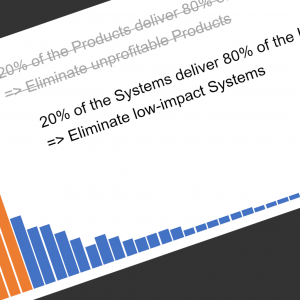
At once the most and least understood, the Cost section is what everybody focuses on (specifically: cost reduction!) but also what controls our ability to do more project and support work with the resources in Enterprise IT.
The sample graph show 13 months – we are including the previous December just to get a decent picture for the first part of the year. Along the top, we show monthly budget performance (green = savings, red = over budget).
Note the big red “miss” in January that stands out so well; the graph design nicely focuses the attention on exceptional events / situations, ad the conversation need only hit the high points.
The second graph (bar chart underneath) is a picture of the IT Budget Forecast; the red bits in the months at the end of the year shows budget cuts already made since the first of the year. If your process is sophisticated enough to incorporate a rolling 18 months forecast, this won’t be an annual picture – we like to show last three months Actuals and next 9 months Forecast.
Why so Terse?
As I review these with some IT veterans, I hear the feedback – these are amazingly terse pictures, potentially glossing over some important details. This is very much by design – in my experience, IT folks tend to get into too much (or the wrong) detail, and are not as sensitive to that glazed look in the eyes of the audience. The idea here is to provide a quick overview at how we are doing – details can be made available if people are interested, but if the overview is sufficient – we move on.
Next Steps
We’re still working to figure out how to incorporate these metrics in a “live” manner on our intranet pages – the challenge is not technical, but behavioral (daily snapshots do much better posted on bulletin boards – especially in a manufacturing environment). The communication culture of the organization is the real determinant of the best way to make this stuff public and accessible.
If you like the reporting style and would like to use it for your organization, let me know – I can create templates for the graphs shown.
20 April, 2013


Comments (0)