

An AI initiative lands on your desk with one ROI number and three stakeholders who'd measure it differently. Here's how to run a single initiative through all three lenses, filter the metrics that matter, and turn the KPI map into the leadership call it's meant to start.
Somebody slides a one-pager across the table. AI-augmented quality inspection on the main production line, projected to pay for itself in fourteen months, here’s the ROI. The number looks great. And the room goes quiet in that particular way that means nobody’s quite sure what to do with it.
You know this meeting. You’ve probably run this meeting. There’s a real initiative on the table, a vendor demo that genuinely impressed people, a champion who wants to move, and a finance lead who has seen enough fourteen-month paybacks evaporate to ask the obvious question – is this number real, and even if it is, is this the thing we should be doing right now?
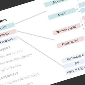
By this point in the series we’ve built up a decent set of tools for that conversation. We looked at what an AI initiative does for shareholders, then for employees, then for customers – three different stakeholders, three different definitions of value, and the productive tension between building a Great Stock and building a Great Company. Call them three lenses.
Here’s the thing nobody hands you, though. When the initiative actually lands on your desk, you don’t get to use the lenses one at a time. You’re not writing three separate articles. You’re sitting in one meeting, with one initiative and one pool of resources, and you have to look through all three lenses at once and then decide. That’s the gap between reading about AI initiative KPIs and actually using them.
So let’s close it: one initiative, all three lenses, and the messy leadership call at the end.
Measurable, Material, Meaningful
Before we run anything through the lenses, we need a way to decide which numbers even belong in the conversation. Because the moment you announce you’re measuring the value of an AI initiative, the candidate metrics show up like relatives at a will reading.
Go looking for guidance and you won’t lack for it. The big consulting frameworks offer four-category taxonomies – business impact, model performance, operational health, risk and governance. The vendor playbooks (IBM and Propeller both have solid ones) split ROI into trending and realized, or layer in model accuracy and adoption curves. There’s nothing wrong with any of it. But notice what they share: they add dimensions. More categories, more metrics, more dashboard. For a leader trying to make one decision in one meeting, more is not the help it looks like.
I’ve always used a tighter filter, and it comes from the shop floor, not the boardroom. A KPI earns a spot on the table when it’s measurable, material, and meaningful. Three quick gates, and most candidate metrics don’t make it through all three.
Measurable means you can put a number on it, and get that number without commissioning a study. You can measure scrap rate. You can’t really measure “improved decision quality.” If you can’t measure it, it’s a belief – hold the belief, just keep it out of the business case.
Material means the number is big enough to move the needle for the company. A two percent gain on a line item that rounds to nothing on the P&L is real, and also irrelevant. Plenty of AI pilots improve something measurable and true that simply doesn’t matter at the company’s scale.
Meaningful means the metric ties back to something a stakeholder actually values – one of those three lenses. A number can be measurable and material and still land with a thud if nobody who matters cares about it. This is the gate that quietly trips up the most impressive-looking dashboards.
Take model accuracy, the number every vendor leads with. A 98% detection rate is measurable, and it sounds material. But if the operators don’t trust the model, or it throws so many false alarms that people start waving the alerts away, that 98% is meaningful to nobody who actually matters. It’s measurable, it’s material, and it still doesn’t belong on the table.
The filter does its best work as a no. It knocks the squishy stuff off the table before the conversation gets going, which is exactly what you want when the room is about to spend real money. So let’s put it to work.
One Initiative, Three Lenses
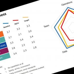
Picture a mid-market manufacturer, call it a fifty to a hundred million dollar shop, with a quality problem that isn’t dramatic but never quite goes away. Defects slip past the line inspectors – not because the inspectors are bad, but because the work is mind-numbing, and a tired human at hour six misses things a camera wouldn’t. The initiative on the table puts machine-vision cameras and an AI inference model at three points on the main line. It flags suspect parts in real time, learns from what gets confirmed, and builds a data trail nobody used to have.
Notice that this one initiative already reaches into four of the five Building Blocks. It’s Operational Excellence on its face, but it runs on Data Mastery (the model is only as good as the data feeding it), it touches Product Intelligence (those defect signals are worth something downstream), and it lands squarely on Team Dynamics the moment a human inspector has to work alongside it. Change one block and you’d better think about the others – which is exactly why a single number can’t hold the whole story. So let’s look through each lens.
The shareholder lens. This is the cost-of-poor-quality conversation, and it’s where the hard dollars live. A real-time inspection model that catches defects at the source moves a stack of line items you can already measure:
– Scrap running at $100K a month, cut roughly in half – call it $50K a month back.
– Rework chewing up $200K in overtime a month, cut by 90% – another $180K.
– Customer returns at $250K a month, down 75% as escapes drop – $62K and change.
That’s earnings growth, plain and simple, and it flows straight to the bottom line. There’s a capital efficiency story too, just a quieter one: fewer warranty claims means a smaller reserve tied up on the balance sheet, and tighter quality lets you carry less safety stock to cover for the bad parts you used to ship. Take a $2M warranty reserve down ten percent and you’ve freed up $200K in cash. These are representative numbers, of course – plug in your own current rates and expected improvements and the shape holds. Every one of them clears all three gates: measurable, material, meaningful. (Multiple Expansion, the third shareholder lever, is harder to pin to a single shop-floor system, though it’s less of a stretch than it used to be now that “what’s your AI story” actually moves valuation multiples. We gave it a real treatment back in the shareholder piece.)
The employee lens. Here’s where the spreadsheet stops helping and the judgment starts. The cynical read is that an inspection AI is a headcount play in a quality project’s clothing – automate the inspectors, book the savings. The honest read is more interesting. The work changes. Instead of staring at parts that are fine ninety-nine times out of a hundred, the inspectors handle the genuinely hard calls, the edge cases the model flags but can’t resolve, and the root-cause hunts nobody had time for when they were buried in routine checks. That’s a better job – if you set it up that way.
And that “if” is the whole game. We said it in the employee piece and it’s worth repeating: AI rollouts don’t fail on the technology, they fail on “set up for success.” Drop a black-box system on the floor that cries wolf and trusts nobody, give people no training and no say in how it runs, and you won’t get engagement, you’ll get a very expensive way to make your best inspectors quit.
Set it up right and it looks different. The inspectors help tune the thresholds, so the model learns what actually matters on this line. They get the override, because a person who can say “no, that one’s fine” stays a craftsman instead of a button-pusher. They see the model’s misses, not just its catches, so they trust it for the right reasons. None of that shows up on the cameras invoice. All of it decides whether the engagement number moves. The metric here is softer but still real – engagement scores in the affected areas, measured the way you’ve always measured them. Move shop-floor engagement a couple of points and you’ve done something that, per Bain’s research, shows up in shareholder returns down the line. That’s Team Dynamics doing its quiet work as the block that makes the others pay off.
The customer lens. This one turns outward, and it’s the shortest conversation because it’s the most direct. Fewer defects escaping the plant means fewer field failures, fewer angry phone calls, and product that does what it’s supposed to do. On-time delivery improves almost as a side effect – you’re not pulling good orders to rework bad ones, so a 90% OTD creeps toward 95% for your key accounts. Customer satisfaction follows the quality and the reliability, because customers experience your quality system whether they know its name or not. That’s Customer Connection, with a thread of Product Intelligence running through it: the defect data you’re now collecting is the start of genuinely understanding how your products behave out in the world.
Three lenses, one initiative, and already you can feel the problem. Each lens tells a true story, and the stories don’t add up to a single number.
It’s a Conversation, Not a Spreadsheet
Put the three lenses side by side and you get something you can actually point at in a meeting – not a verdict, but a map:
– Shareholders: cost of poor quality down hard – scrap, rework, returns, plus a freed-up warranty reserve and leaner inventory. Hard dollars, this year. Clear yes.
– Employees: a better job for the inspectors and a couple of points of engagement – but only if you fund the training and the change, not just the cameras. Conditional yes.
– Customers: fewer escapes, better on-time delivery, higher satisfaction. Quieter, slower to show up, real. Yes.
That’s the substrate. And here’s the part the frameworks never quite tell you: the map doesn’t make the decision. You do. The map just makes sure everyone in the room is arguing about the same thing.
This particular initiative is the easy case, because it happens to be a rare three-way winner. Most aren’t. Plenty of good initiatives are lopsided – a back-office automation that’s terrific for the shareholders and barely registers for employees or customers, or a customer-experience investment that won’t touch earnings for a year. Lopsided is fine. A leadership team is allowed to greenlight an initiative that serves one stakeholder and leaves the others flat. What it’s not allowed to do is pretend the lopsided one is balanced, or pick it by accident because nobody held up the other two lenses. The failure mode isn’t the imbalance. It’s the imbalance you didn’t notice.
That’s the whole reason we kept the three lenses in tension across this series. Decisions that build a Great Stock can run flat against the ones that build a Great Company, and the reverse. You can slash costs to defend this quarter’s earnings, but you can only cut so far before the math stops working – engaged teams and strong customer relationships are what deliver next quarter, and the one after. The job of a strong leadership team is to sit in that tension on purpose, with open communication and a clear sense of where the company is going, and decide which way to lean this time.
And the rigor is worth it, because the spread is real. The research we leaned on in the shareholder piece – BCG, McKinsey, Bain – all points the same direction: the companies pulling away with AI aren’t the ones running the most pilots. They’re the ones picking well. A KPI map across three lenses is how you pick well. It’s the difference between a portfolio of initiatives that each earn their keep and a graveyard of impressive demos.
So that’s the move. One initiative, three lenses, a map you can put on the table, and a leadership team willing to do the actual deciding. It works. I’ve watched it turn a stalled “is the number even real?” standoff into a real conversation about what the company is trying to build.
But I’d be selling you something if I stopped here, because a clean KPI map is necessary and nowhere near sufficient. You can run a beautiful three-lens analysis on an initiative that still goes nowhere – because the metrics, however measurable and material and meaningful, aren’t actually owned by anyone. Nobody’s goals depend on them. The cameras get installed, the dashboard goes live, and six months later the scrap rate hasn’t budged, because no human being was ever on the hook for moving it.
That gap – between a metric that looks owned and a goal that actually is – is the whole subject of the last piece in this series. The KPI map tells you whether an initiative could create value. Whether it will comes down to alignment, and alignment is a harder, more human thing than any spreadsheet lets on.
For now, though, you’ve got plenty of ammunition. A representative initiative, three lenses, simple metrics that tie to value the company actually cares about. Build your own version, plug in your own numbers, and walk into that meeting ready.
Just make sure you’re ready to measure it.
Want a hand thinking through the prioritization call for your own AI initiatives? That’s exactly what we’re building JazzAI to do. Join the mailing list and I’ll send along what’s useful as it comes together.
Related Articles
- 5 AI Metrics That Actually Prove ROI to Your Board – Gartner on moving past activity metrics like adoption and productivity to the handful of numbers that actually land in the boardroom.
- AI ROI measurement for scalable value, trust and performance – KPMG on why one clear business outcome per use case beats a broad rollout that dilutes ownership and makes ROI impossible to prove.
- ROI and Success Metrics – Agility at Scale on the trending-versus-realized ROI gap and why measuring only realized returns kills good initiatives during the capability-building phase.
Recommended Books
- Don’t Think So Much – Jim MacLennan on making AI and digital transformation practical, without overthinking the measurement.
- How to Measure Anything – Douglas Hubbard on putting a real number on the things people swear can’t be measured, which is most of the “squishy” KPIs.
- Measure What Matters – John Doerr on OKRs and tying metrics to goals that specific people own, the bridge from a KPI map to actual accountability.
24 June, 2026


Comments (0)