- SQDC for Enterprise IT – Introduction, Safety
- SQDC for Enterprise IT – Quality, Delivery
- SQDC for Enterprise IT – Cost, Next Steps
One of a series of posts on presenting a summarized view of Corporate IT using SQDC-style KPIs - a Lean Management-inspired way of speaking in a language your Manufacturing Operations teams will understand.
Quality
 I’ve seen a range of KPIs in the Quality column on different manufacturing plants’ SQDC boards, but nothing as consistent as the Safety Calendar in column #1. If I try to identify a general theme behind the Quality KPIs that I’ve seen, it would be “reliability” – so for Enterprise IT, I want to focus on an important risk issue – the reliability (and lack thereof) of the data center and network.
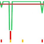
To the right – a sample version (last 30 days) I might show in the monthly executive staff meeting …
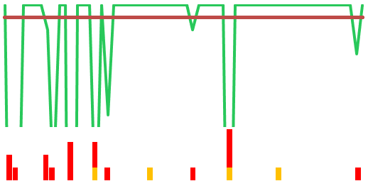
… but to better illustrate, let me expand that picture a bit, showing the last 60 days …

In the graph above, we display Quality of Service over the last month or so. The horizontal red line indicates 99% uptime – a typical guaranteed SLO. The green line indicates actual quality of service – and this data shows a DC and network that have been experiencing an inordinate number of performance and system availability issues. The red and yellow dots below the graph are a count of unique Severity 1 (sev1) and Severity 2 (sev2) incidents. In a well-run data center, these should be few and far between – the number shown should be somewhat alarming – and this simple graphic representation helps make the point.
If this were your corporate network, you probably need to get the right level of awareness for your audience – without diving into all the techie details of root cause (unless there are follow-up questions, of course). You are trying to show the amount of attention being paid to this area by internal IT – that’s why the overall indicator would be Red.
Delivery
 Delivery is all about expressing your Enterprise IT projects with an on time delivery mentality, while balancing the competition between “delivery date”, “requirements”, and “resources”.
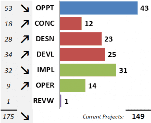
The graph shows the count of projects in each of the phases in our PMO. There’s actually a lot of information squeezed into this graphic (it’s hard to communicate complex information in a 1.5″ square) …
- Demand: We show each phase of our project methodology, and a raw count of projects in each phase. We also show the previous months’ count and directional trend, so we can get some idea of progress.
- The Funnel: The picture is supposed to look something like a funnel – lots of projects in the early Opportunity (OPPT) phase, just trying to get visibility and traction. As ideas are fleshed out, resources prioritized, and attention is focused, the numbers should reduce as you drive farther into the project phases.
We’re still noodling around with this graphic – it’s a bit of a journey, as we work to figure out the best way to illustrate IT Project delivery
In the next post, I’ll explain the last KPI – Cost – and talk a bit about what comes next.
14 April, 2013


Comments (0)