a bit of code on a Saturday night …
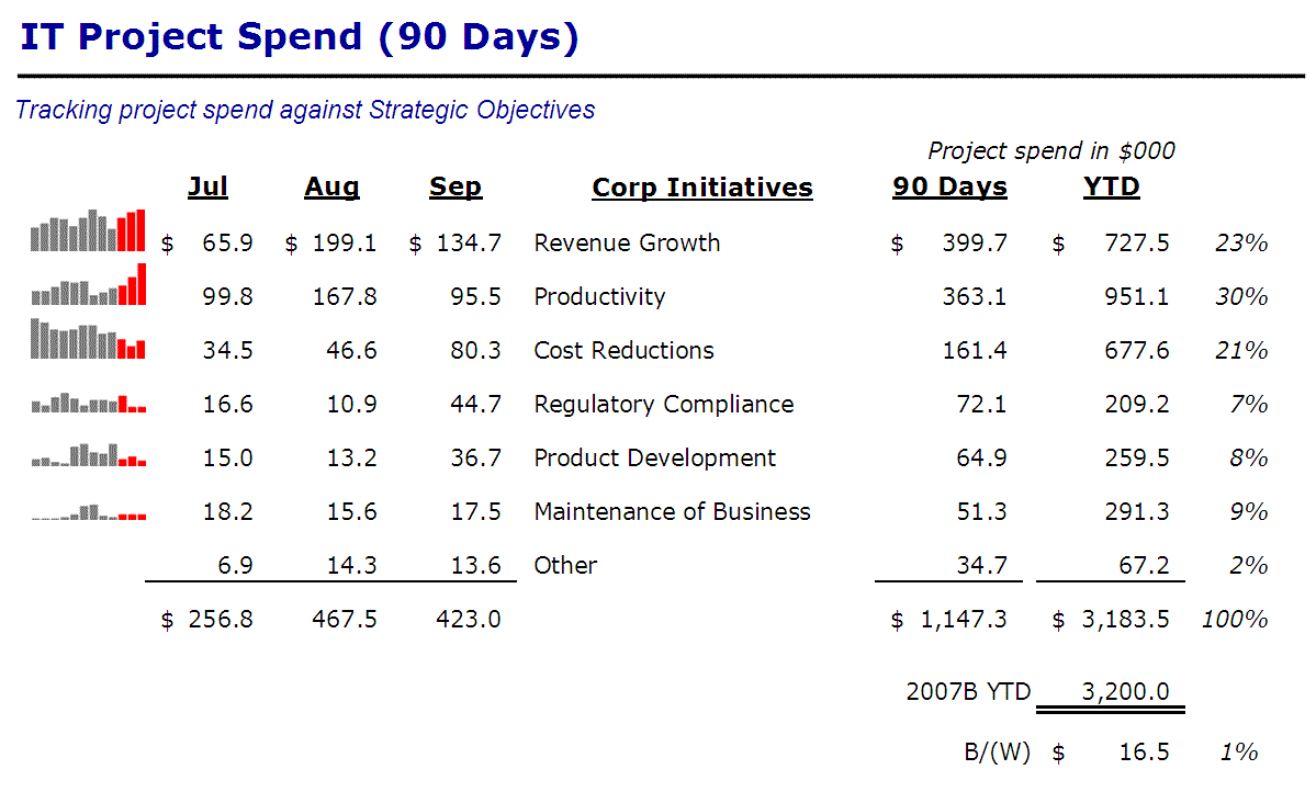
I’ve written before about a simple way to measure and report IT value to the business – quantifying alignment with strategic initiatives project spend in context. It all culminated with a single, simple slide – numbers, with some Tufte-esque Sparklines thrown in.
Well, technologies come and go, and without going into the boring details, I’ve had to come up with a new way to generate the mini-bar charts along the left side there. It ended up being a relatively straightforward task in Excel VBA – yes, of course the table of data is being driven from a spreadsheet.
Here’s the macro that does the trick – I just create a little HTML file that generate the bar charts in series (please excuse the hard-coding) …
[code lang=”vb”]Sub CreateSparklinesDisplayFile()Dim sOutFile As String
Dim iStartRow, iStopRow As Integer
Dim iStartCol, iStopCol As Integer
Dim i, j As Integer
Dim sDataString As String
sOutFile = Range("rOutFileName").Value
iStartRow = Range("rStartRow").Value ‘ First row of data to be graphed
iStopRow = Range("rStopRow").Value ‘ Last row of data to be graphed
iStartCol = Range("rStartColumn").Value ‘ First column of data to be graphed (includes column of series names
iStopCol = Range("rStopColumn").Value ‘ Last column of data to be graphed
Open sOutFile For Output As #1
Print #1, "BizUpdate Sparklines>/title>"
Print #1, ""
Print #1, "Sparklines for last 12-months spend, IT Projects, by Initiative"
‘ Loop thru the lines in the table to generate the separate sparklines
For i = iStartRow To iStopRow
Print #1, "</pre>
" & Cells(i, iStartCol).Value & "
<pre>"
Print #1, "</pre>
<img src="<a href="http://chart.apis.google.com/chart">http://chart.apis.google.com/chart</a>?"
Print #1, "chs=100×35" " alt="" height="" />
<pre>sDataString = "&chd=t:"
For j = (iStartCol + 1) To (iStopCol – 3)
sDataString = sDataString & Cells(i, j).Value & ","
Next j
sDataString = sDataString & "0,0,0|0,0,0,0,0,0,0,0,0"
For j = (iStopCol – 2) To (iStopCol)
sDataString = sDataString & "," & Cells(i, j).Value
Next j
Print #1, sDataString
Print #1, "&cht=bvs"
Print #1, "&chbh=a,2"
Print #1, "&chco=CCCCCC,FF3300"
Print #1, "&chds=0,100,0,100’"
Print #1, "title=’" & Cells(i, iStartCol).Value & "’ />"
Print #1, ""
Next i
Print #1, "</span></small>
<pre>"
Print #1, ""
Close #1
End Sub
[/code]
The output file looks something like this (a simplified version …)
[code lang=”html”]<html>
<head>
<title>BizUpdate Sparklines</title>
</head>
<body>
<p>Sparklines for last 12-months spend, IT Projects, by Initiative</p>
<p>Data runs from through </p>
<P>Integration</P>
<img src=’http://chart.apis.google.com/chart?
chs=90×30
&chd=t:29.3514,2.795,6.435,1.235,1.755,9.49,21.9661,33.7545,43.0014,0,0,0|0,0,0,0,0,0,0,0,0,104.1521,133.80185,176.267
&cht=bvs
&chbh=a,2
&chco=6666FF,FF3300
&chds=0,200,0,200′
title=’Integration’ />
<P>Growth & Innovation</P>
<img src=’http://chart.apis.google.com/chart?
chs=90×30
&chd=t:68.57045,84.0723000000002,110.0905,97.9752800000002,126.0103,114.8720625,99.9466000000003,67.1827000000001,97.98165,0,0,0|0,0,0,0,0,0,0,0,0,113.22155,96.7057000000002,96.21365
&cht=bvs
&chbh=a,2
&chco=6666FF,FF3300
&chds=0,200,0,200′
title=’Growth & Innovation’ />
<p>Total IT Project Spend … </p>
<img src=’http://chart.apis.google.com/chart?
chs=90×30
&chd=t:312.56875,304.185375,366.746575,328.214055,370.6534,368.8695075,396.3171225,354.440775,329.371575,0,0,0|0,0,0,0,0,0,0,0,0,418.8067,424.3772,464.768135
&chd=t:312.56875,304.185375,366.746575,328.214055,370.6534,368.8695075,396.3171225,354.440775,329.371575,0,0,0|0,0,0,0,0,0,0,0,0,418.8067,424.3772,464.76813
&cht=bvs
&chbh=a,2
&chco=333333,FF3300
&chds=0,500,0,500′
<br>
<p>Generated on Sun, Jan 08, 2012 at 12:53:22 pm</p>
</body>
</html>
Some things I noted when constructing this stuff …
- The Google Chart API seems to be picky about the order of the various parameters. I had some troubles getting the charts to work unless I output things just so
- I can control a lot about these graphs, but I couldn’t get rid of the x-axis. Yes, there is a chart type for “sparklines” (cht=ls), but that’s for line graphs only
- I am calling out the last three months spend in the table, so I want to highlight them in the charts, hence the little hiccup in the j loop
(Updated January 8, 2012: I have published a sample spreadsheet with the code above on my Projects page – check out the VBA Excel section …)


Comments (0)