Between business requests and breathless vendors, I am getting caught up in the growing tide of interest in “data visualizations” – managers requesting highly interactive, highly graphical, highly intuitive analytics interfaces (think Minority Report). But what are we trying to accomplish here? We keep on hearing about “executive dashboards”, a heads-up display of in-my-face KPIs, or statistics and exceptions delivered automatically to my e-mail and/or Blackberry. However, when I ask management folks to get a bit more specific – how would you actually use this information? Is there an interest in doing the drill down, the click through, the hand waving? Not so much – basically, I’ve heard that folks are satisfied with what they have (ex. daily sales reports or customer service metrics), and are not necessarily interested in micromanaging through their staffs (by drilling down through graphical views on their desktop).
The real interest is in giving the right “stuff” to middle management and team leaders …
- Data Sets – access to transactional data in enough detail to permit mixing, matching, slicing, and dicing, to identify and target hidden opportunities for business value (growth and/or savings)
- Data Access Tools that provides fast and flexible manipulation of the figures
- New and different Data Visualizations to enable insight and help target opportunities
… and we can iterate on these already:
- The first item – access to data – is getting easier over time. Projects like data warehousing and ERP implementations have taught companies the value of clean transaction data and correct & complete master data. We are also expanding the number of folks that know how to do basic query and extract operations, from all sorts of transaction systems (on premise and in the cloud), into data sets that can be manipulated off-line.
- Next – most folks can and should be happy with Excel and pivot tables – especially with the improvements in Office 2007 and beyond. It’s becoming easier to specify filters, cross tabs, and aggregate operations, and Excel can also handle reasonably large data sets – tens of thousands of rows.
We are certainly not “finished” with #1 and #2 – still plenty of work to do in terms of data cleansing, data access and basic manipulation. However, the biggest opportunities for improvement in 2010 are in the area of visualizations – new and different ways to display multidimensional data.
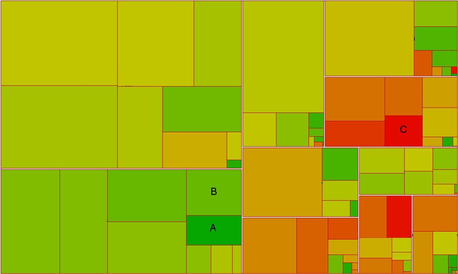
Here’s a simple example of profitability analysis using a visualization that is not available in Excel:

This type of graph is called a tree map or heat map. It’s a basic query – show gross sales by customer for a number of product families, but this clever picture shows a number of things in a two dimensional view:
- Area in the graph represents sales – represented in dollars
- White borders denote product families – like Cookies, Diet Snacks, and Organic Food
- Red borders carve out specific customers
- Color represents degree of profitability – the most profitable are bright green, and the least profitable are bright red.
With a quick explanation of what you are looking at, targets of opportunity jump out at you – go for the big red boxes (like C) to cut the non-profitable stuff, or the really green boxes (like A) to sell more of the really profitable stuff. You can also get a bit more imaginative, looking for the right blend of size and shade to find customers “on the edge” of going really green (how can we make B as green as their neighbor, A)?
Creating Opportunities for Insight – Playing with Visualizations
To really get at #3, we may need better tools, but we also need some new and different communication design ideas. What types of data visualization are possible, given the dimensions of the data we have? Which visualizations might lead to some interesting insights? Or, take the opposite view – given a particular data set, what truths are in there, and how might we draw a picture of that (to clearly illustrate these truths for the interested observer)?
Clearly, there is no cookbook approach to something like this. It takes a certain amount of insight and imagination, and that is a critical skill combination that most IT departments, by nature, simply do not have. IT and Finance are two areas where structure and process typically trump design sensibilities.
No, I’m not saying that there is no artistic ability anywhere in IT; it just doesn’t come out very often as we labor away on our project deliverables. As previously noted, corporate IT is typically not rewarded for design – just results (done = good, “good” = meh).
I don’t think that the business is asking for fancy tools as much as creativity and new ideas for ways to represent business questions and answers. Instead of the same old bar charts and tables of color-coded numbers – is there a better way to visualize this data to facilitate insights?
Next … sources of inspiration …


Comments (0)