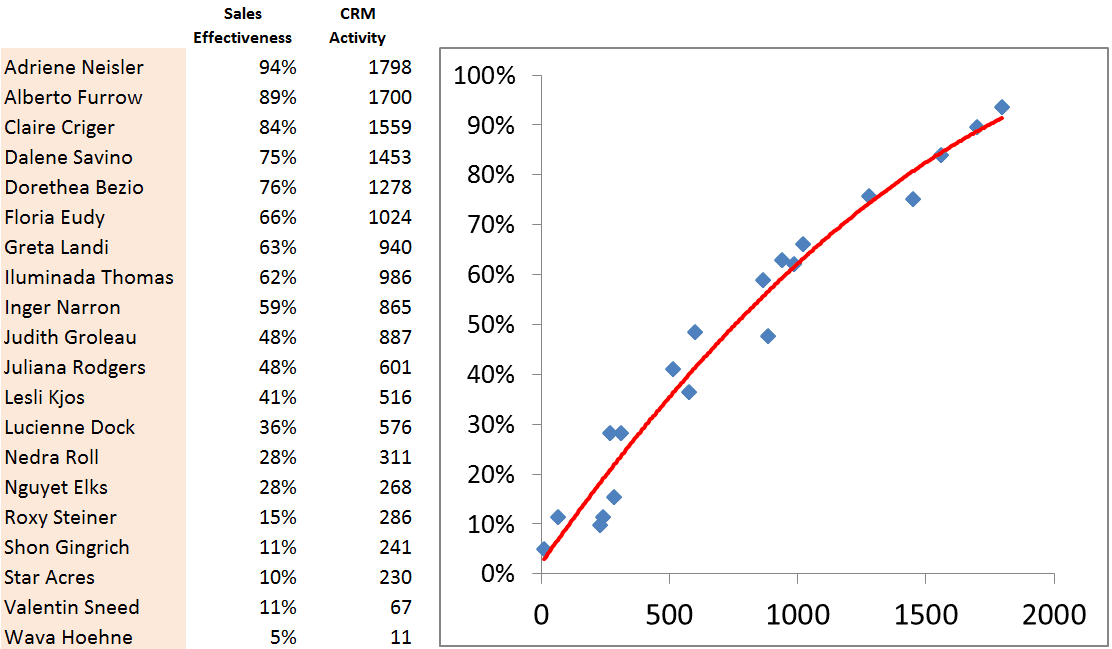
We’ve got the activity captured, and now we have “effectiveness” ratings for the people in the group – how will we put them together and see a relationship? Mechanically, this is a simple XY scatter graph – a standard chart type in both Excel and Google Docs. Let’s take a look at a sample data set that illustrates the idea:

This is the picture I expected to see: the more you use the system (the X axis), the more results you get (the Y axis) – clarity with the help of a trend line. But wait – not so fast; I even said it wrong just then. A common mistake: we should not immediately jump to the casual assumption (If you use the system, you will be successful). It is probably more accurate to say there may be a correlation between system use and success on our important metrics.
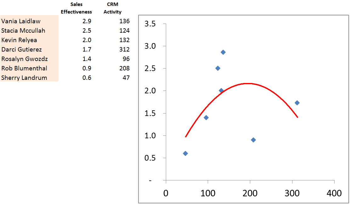
Why the wishy-washy tone? Stories and real-world will help illustrate the challenge; the group above that so perfectly illustrates my theory is just made-up data – but check out these “real” [anonymized] teams and results …

Here we have a few outliers in the group that ruin the curve – but when you know that Rob is an intern that is taking on a lot of data entry for the group, and Vania is an internal sales rep working a set of direct customers, the relationship makes sense.
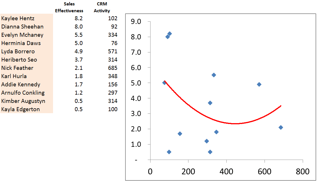
Or maybe this example …

What are Kayla and Dianna doing – aside from ignoring the CRM system – that makes them so successful? What parts of that same system are helping Evelyn deliver the goods better than her peers? Does this data set show that the system actually gets in the way? For this team, it seems like heavy system use has little impact on success – more often than not, less system use translates to better results.
All you can really do with a data set is show the picture and propose a correlation. Factors like sample size, roles, and different markets / customer types will always impact the results. However, this picture gives the team manager interesting insights into what might be going on.
Visualizations like this will give you some hints on the right questions to ask, and who to ask them to. They won’t provide the answer, but they will help form the right questions.
… the names were changed to protect the innocent … thanks to this site …
Previously in this series …


Comments (0)