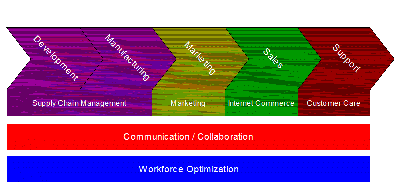
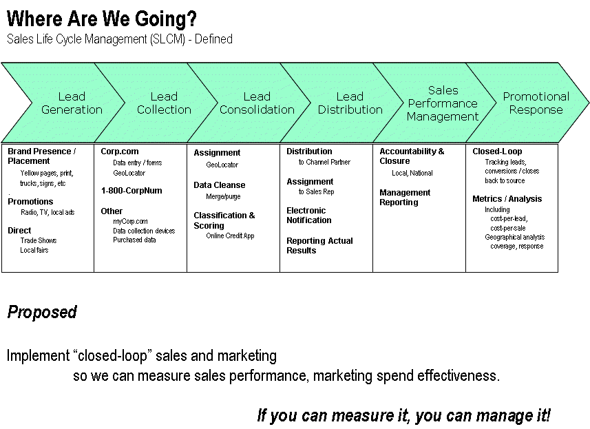
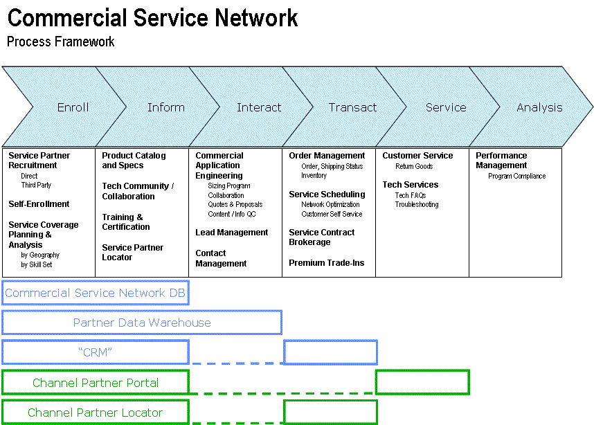
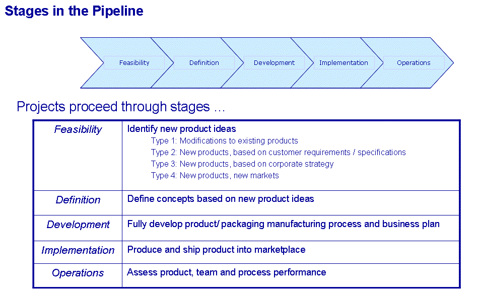
I remember in the late 90’s, seeing many examples of the little train of wedgies that folks used to characterize their business processes:


I’ve used them myself (some of the above samples are mine, I’m comfortable in admitting it) – of course, I typically don’t make this stuff up, I adapt from other examples, like everyone else. As I searched for a reasonable picture / schematic / “framework” for a “supply chain”, I stumbled across what I believe to be the originator of the wedgie charts – the value chain, popularized by Porter in the 80’s.
An interesting sense of satisfaction came with this discovery; I always used to wonder where the ubiquitous wedgies originated, as if I wasn’t giving the right credit / citing the correct references, or jumping on some meme-hack’s visual bandwagon instead of really understanding the pretty pictures I was drawing.


Still, I remain a big fan of this visual “framework” approach. I’ve used it for business / technical alignment architectures, for laying out a complex program of interdependent projects, and for abstracting a data warehouse architecture so folks could see the pattern(s) in the multiple legacy systems (enough to identify opportunities for compressing into a smaller set of technologies).
Anyway, I also found this site, and with it my latest model for a framework to capture the Supply Chain …


Comments (0)